Stop • Look • Listen
Child-Friendly Wayfinding System
Using design to give children a voice on streets built for adults
Problem overview:
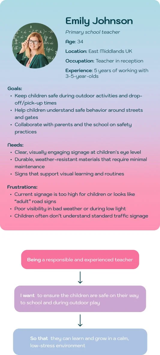
A visual safety campaign designed for children aged 3–6 around school zones.
The goal was to create a clear, memorable system that young children can actually read and react to. Unlike conventional adult road signs, which are placed too high above their eye level.
My role: Art direction, illustration, visual identity, animation, mockups.
Deliverables: Icon system, colour palette, type treatment, pavement signage, collectables, animation frame and environmental mockups.
A Gap Hiding in Plain Sight on Every School Run
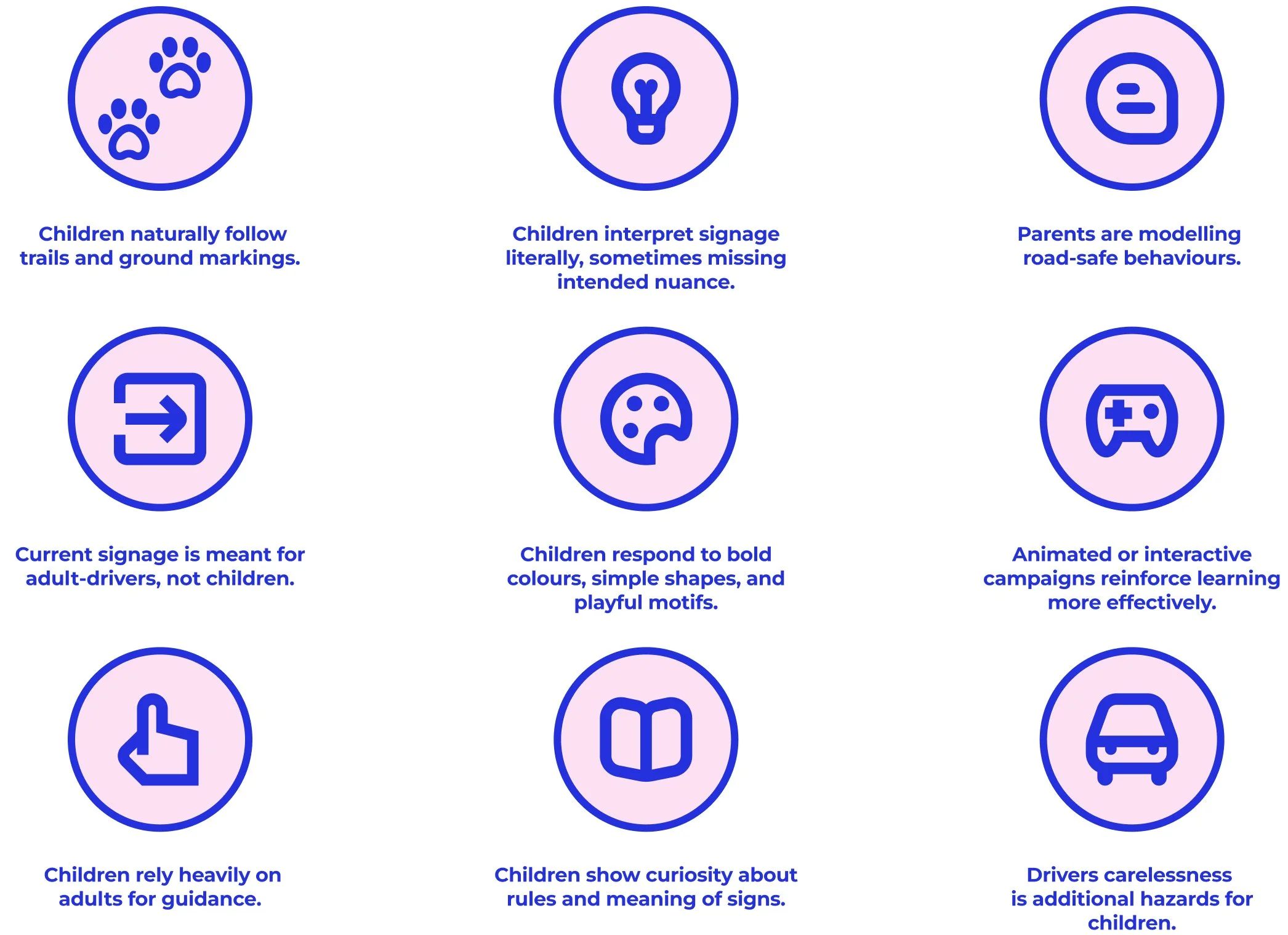
Young children don’t interpret road signs the same way adults do.
Interviews with parents and teachers revealed three issues:
• Signs are placed too high for children to see
• Written or abstract symbols are too complex
• Kids respond best to literal, playful, colourful visuals
The challenge:
Create a visual language that works at a child’s height, using simple cues they immediately understand.
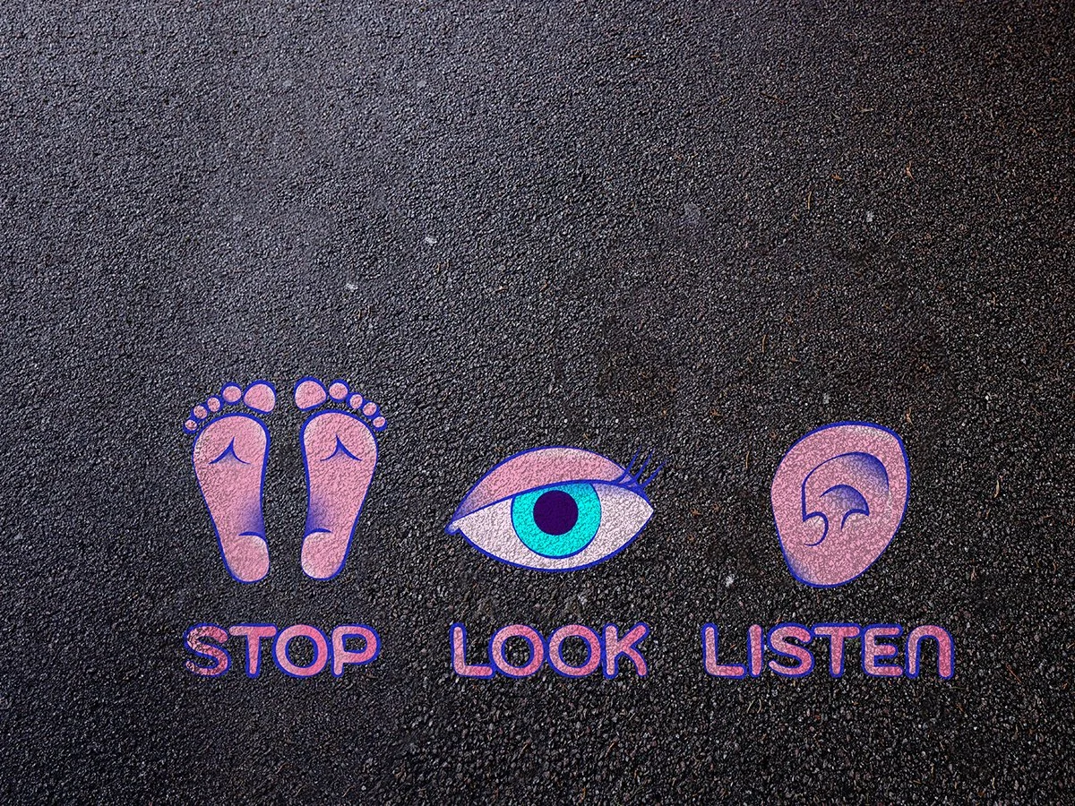
Insight
Children consistently used one phrase: "Stop, Look, Listen.”
This became the backbone of the visual system.
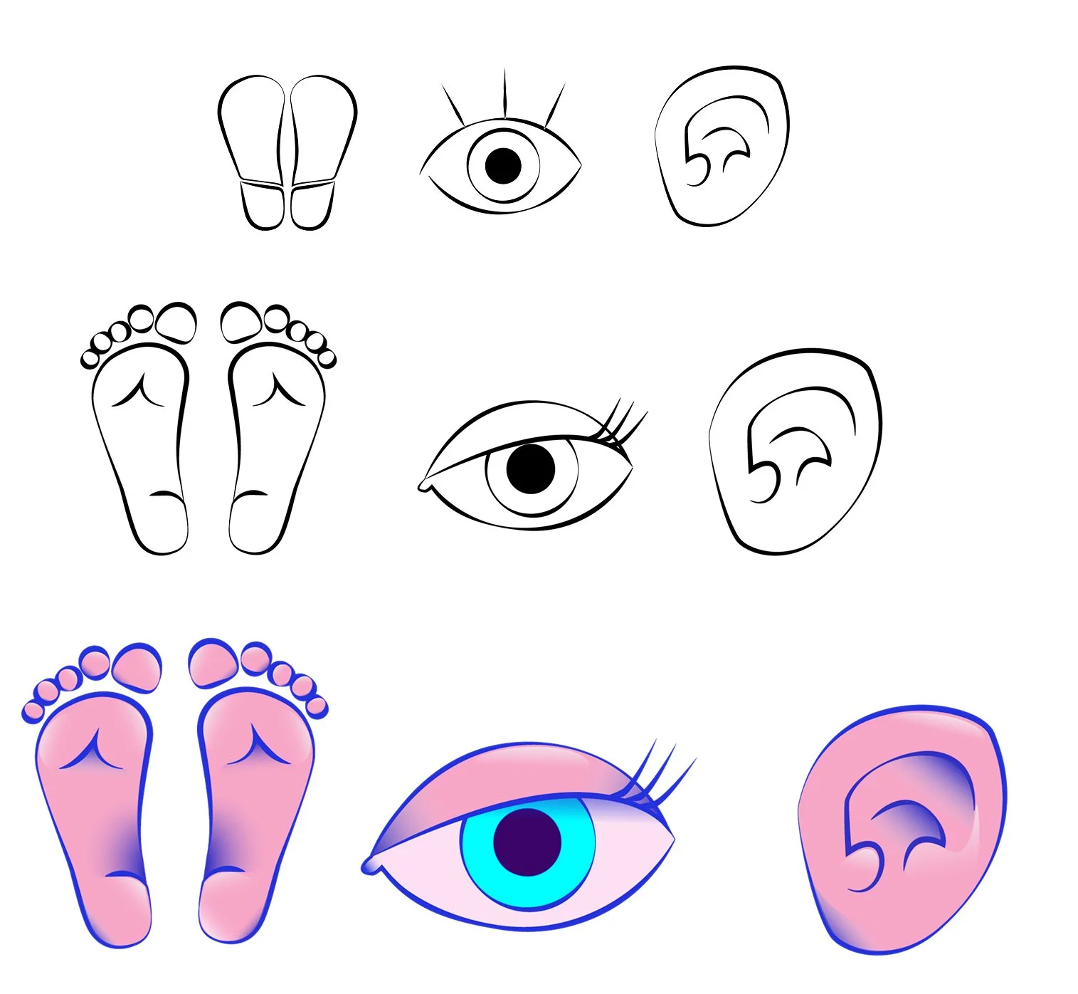
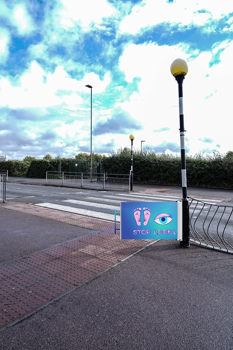
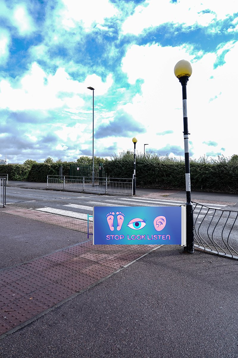
Each action was translated into a single, literal symbol:
• Footprints = Stop
• Eye = Look
• Ear = Listen
Clear, intuitive, and tied directly to how children naturally describe crossing the road.
The visual Identity system development
Icons were iterated for simplicity and personality.
Flat pictograms felt too clinical; highly detailed illustrations felt distracting.
The final style uses soft gradients and bold outlines. Clear enough to read instantly, playful enough to attract a child’s attention.
Icons
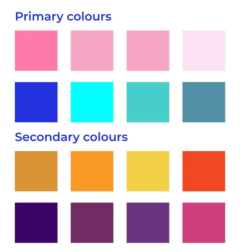
Colour Palette
The colour palette avoids red, yellow and green (common road-safety colours that can create exclusion or confusion).
Instead, it uses bright pinks, blues, and teals:
high contrast, inclusive, and friendly.
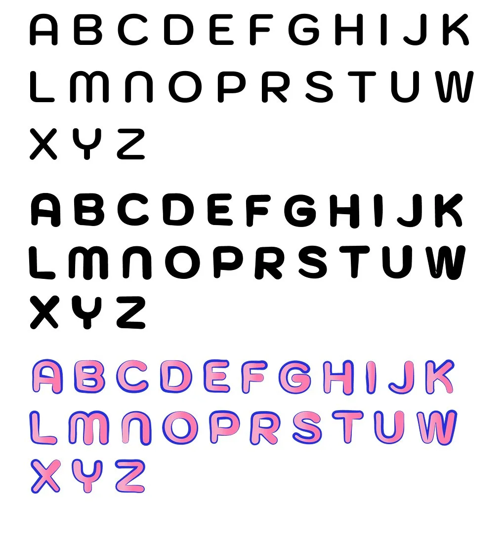
Typography
Kochasann was adapted to match the rounded, child-friendly feel of the icons.
Letterforms were slightly modified for personality while maintaining legibility.
Applying the system
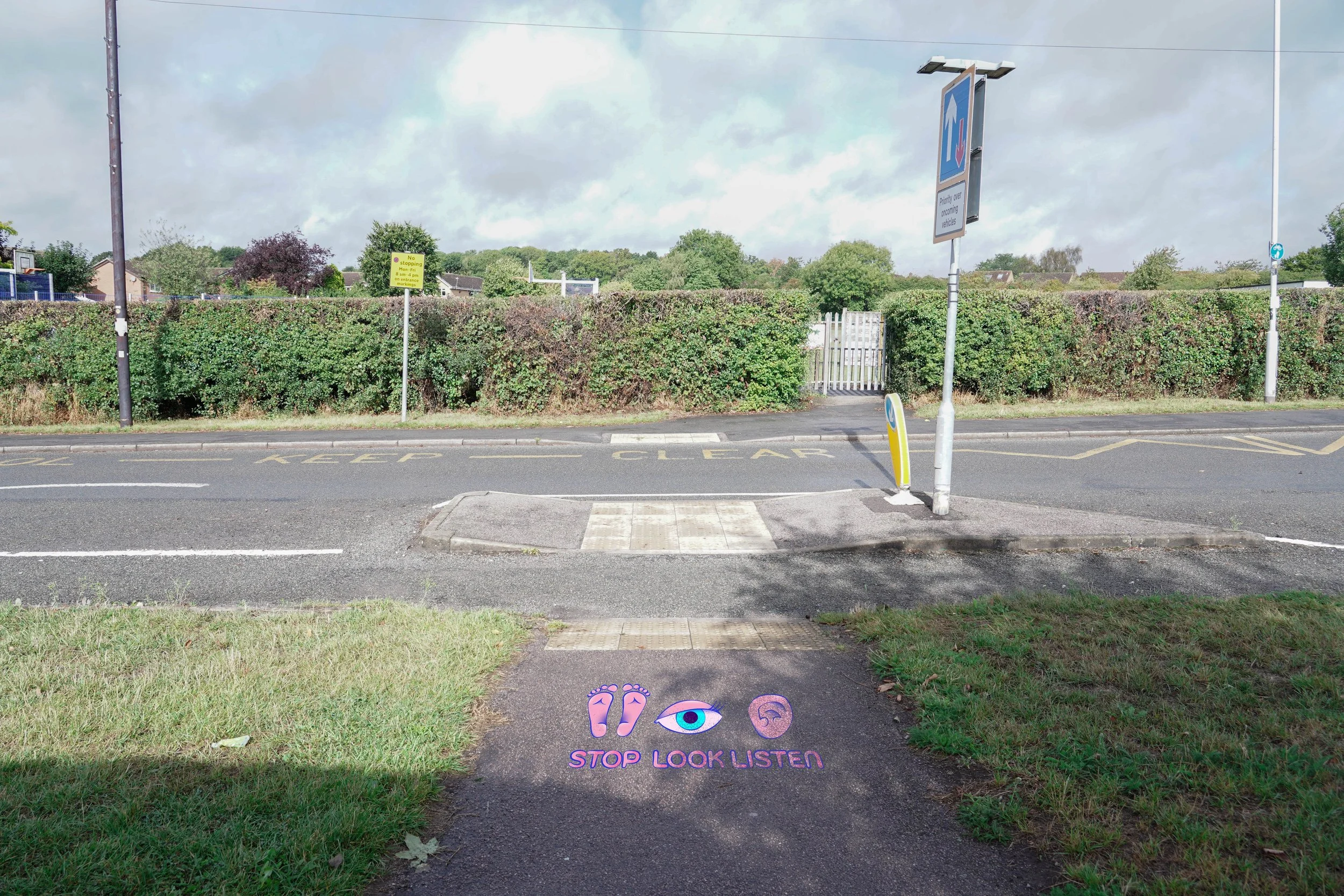
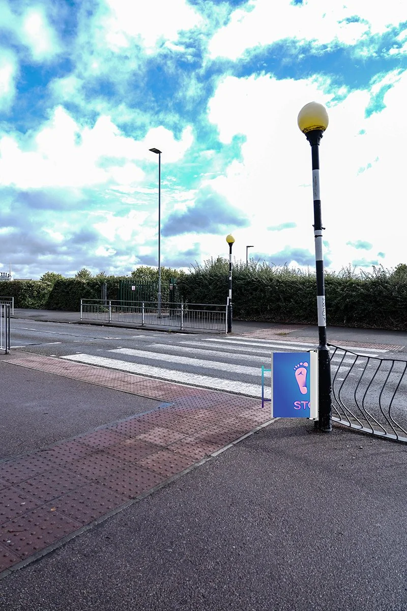
Pavement Signage
The icons were tested on pavement contexts, where children actually look.
Digital mockups show scale, visibility, and how the system behaves in real environments.
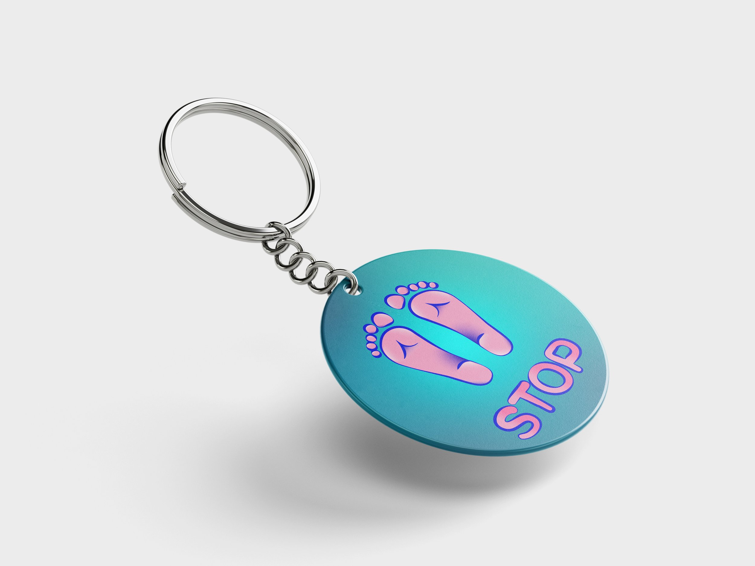
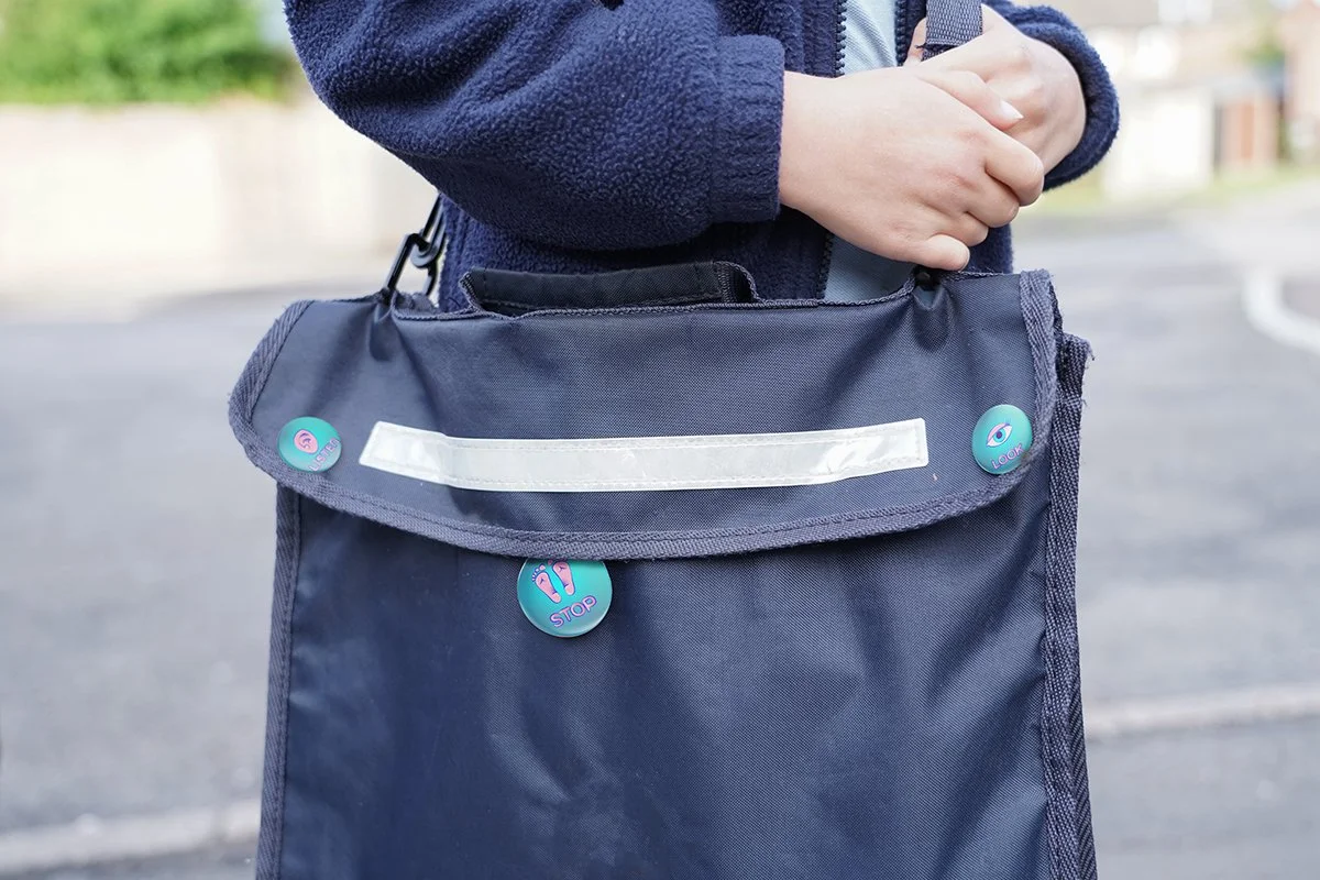
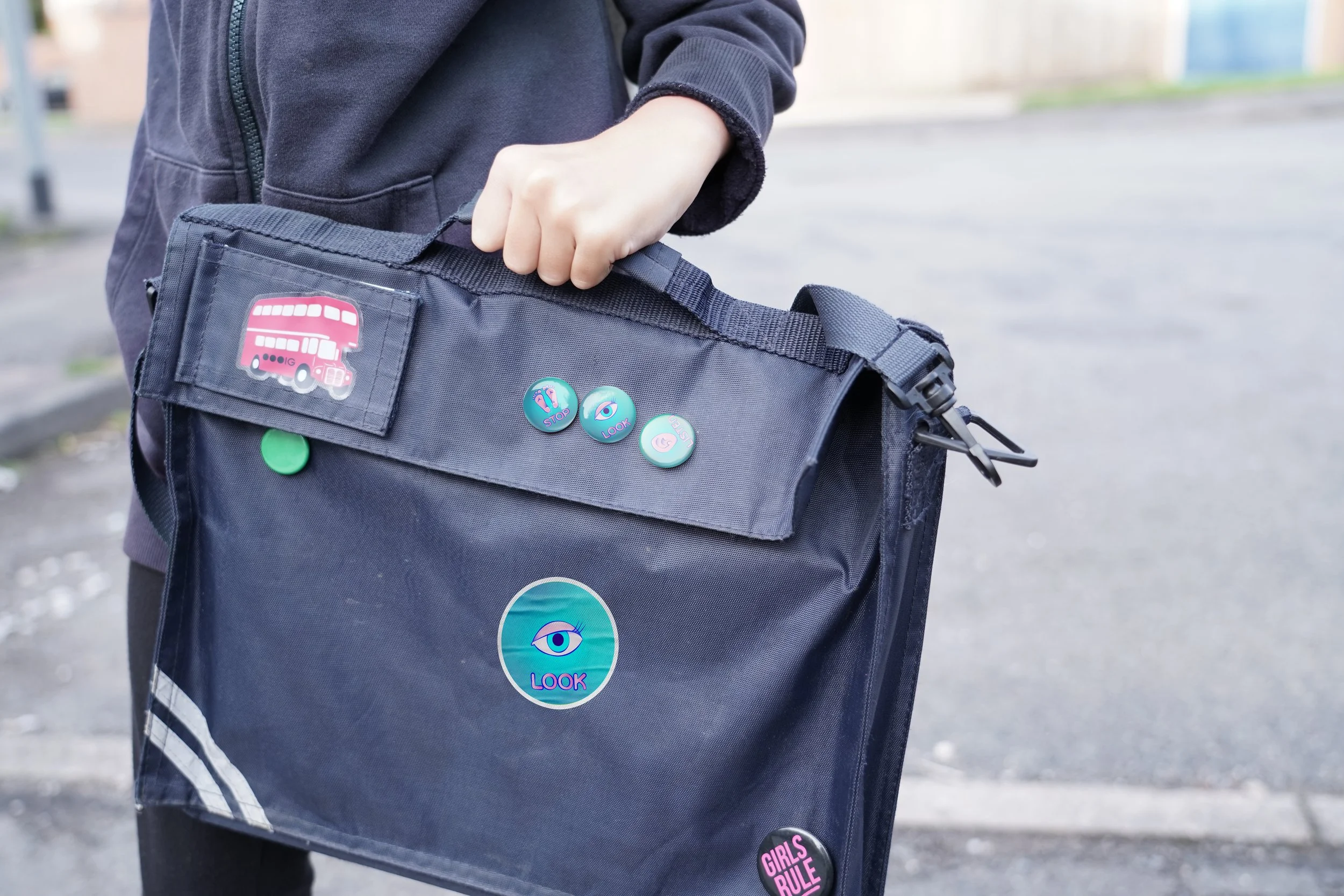
Collectables
To extend the campaign, I designed stickers, pins, and reflective keychains using the icon set.
These act as rewards and as a subtle reinforcement
of the safety message children carry with them.
Interactive elements
Example of an interactive installation in roll-up style.
A child can come and pull a handle to uncover the message.
Outcome
The final system creates a clear, child-centred approach to road safety:
• Icons that match children’s natural language
• Signage placed at a child’s eye level
• High-contrast visuals that stay readable in low light
• A flexible identity usable across pavement markings, classrooms, collectables, and animations
This project strengthened my practice in illustration, motion, environmental design, and research-led branding, and confirmed that clear, playful visuals can genuinely improve safety.