Commute Reality Check
An independent browser extension experiment that brings commute visibility into the job-search workflow, helping users make faster decisions without leaving the page.
I noticed repeated behavioural friction in my own job search: opening Google Maps for every promising listing to answer one question: Is this realistically commutable?
Role: Product concept, UX design, and AI-assisted MVP prototyping
Timeline: Initial research (2024), active build iterations (2025–2026)
Status: Private working MVP (not publicly released)
Tools: Figma, Claude, ChatGPT.
The location data is not enough. I needed a decision-ready context at the moment of browsing.
The friction worth solving.
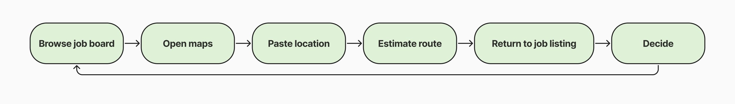
Job listings rarely provide decision-ready commute context. They often include a city as the office location. It is often not enough information to understand the actual commute impact. That forces users to repeatedly leave the job board, check maps manually, estimate travel time, then return to continue browsing.
During my job search, I found a promising role that appeared under my Loughborough search filter. Only after manually checking Google Maps did I realise the company was actually based in Northern Ireland. The commute was nearly eight hours and included a ferry crossing. The role itself was not the problem. The problem was that I had already spent time evaluating a job that was never realistically reachable. That experience exposed a gap in most job boards: they show location names, not commute reality.
The standard workflow looked like this:
Is this just my habit?
I timed my own process. A single commute check took between 52 and 90 seconds. That sounds insignificant until you repeat it dozens of times during a job search. To understand whether this frustration extended beyond my own experience, I ran a small directional survey with 31 respondents from professional and design-adjacent communities.
87% check location before applying.
64% said location influences whether they apply.
45% said integrated commute visibility would be useful.
The sample was small and biased toward professionals, so I treated it as directional evidence rather than validation. The signal was strong enough to justify building an MVP.
Product solution
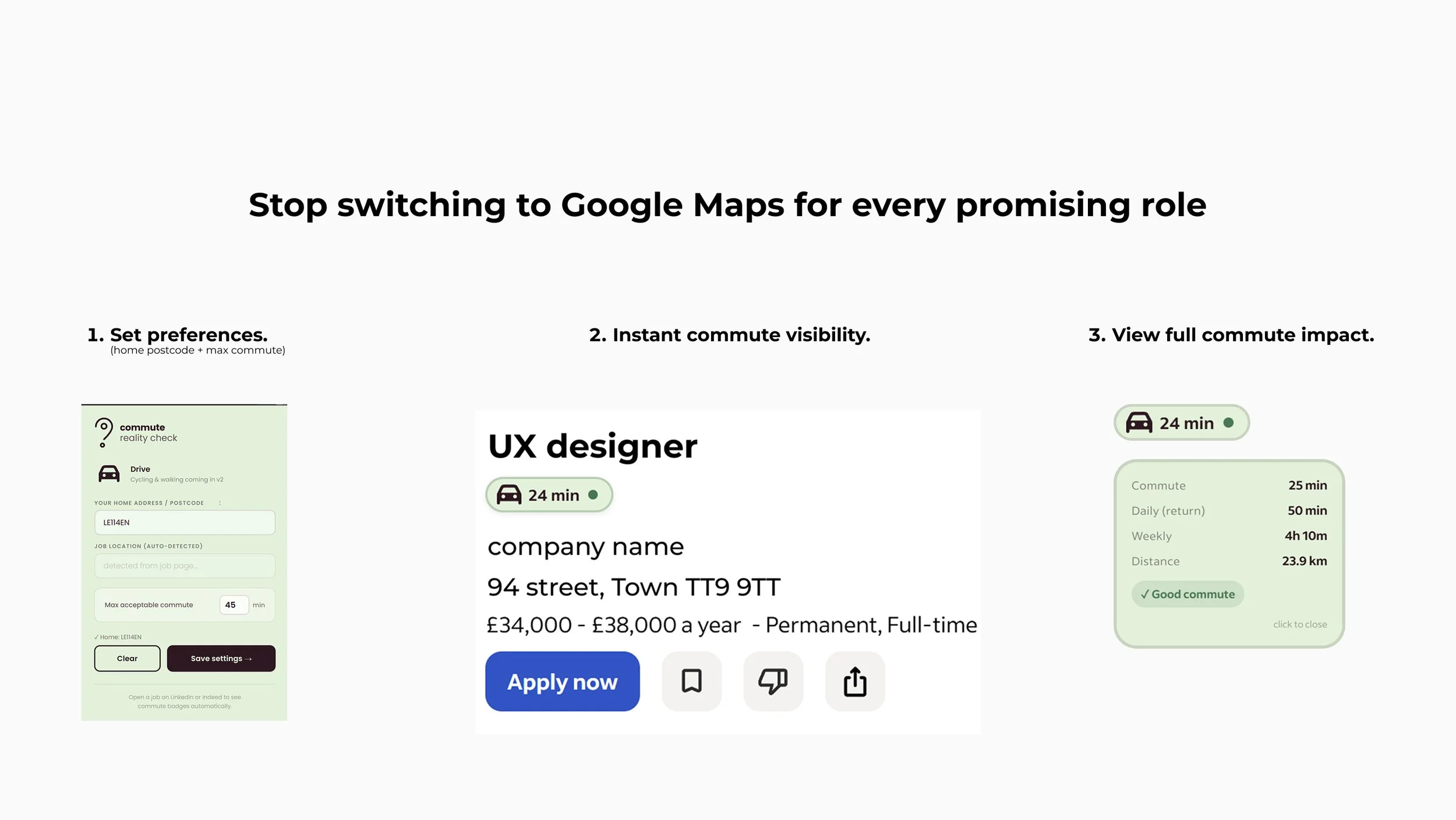
The MVP works as a lightweight browser extension. Users enter their postcode or address, define a maximum commute threshold, and browse supported job boards as normal.
Within seconds, commute badges appear directly inside listings.
Default state → One-way driving commute colour coded for Good, Acceptable, and Poor.
Expanded state → One-way commute, Daily return commute, Weekly commute, Distance, Commute rating: Good, Acceptable, or Poor
Designing for edge cases:
A badge is only useful when users trust it. That meant designing explicit states for situations where reliable information was unavailable.
Remote roles. The interface displays a dedicated Remote Role state and disables unnecessary interactions. The commute from your bed to your desk is already known.
Commute unavailable. When employer location data is too vague to calculate reliably, the system communicates that clearly instead of producing misleading results.
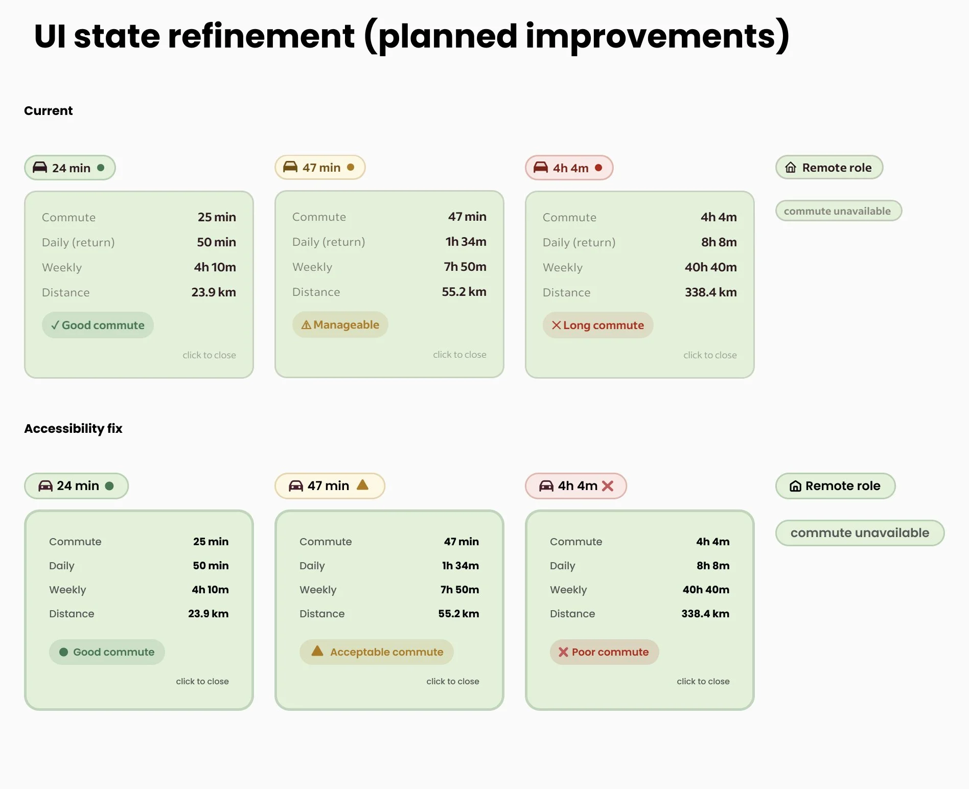
Accessibility refinement
Early versions relied too heavily on colour. The revised design introduces iconography and stronger semantic labels alongside colour cues.
Good commute - circle
Acceptable commute - triangle
Poor commute - cross
This reduces reliance on colour perception and improves clarity across different user needs.
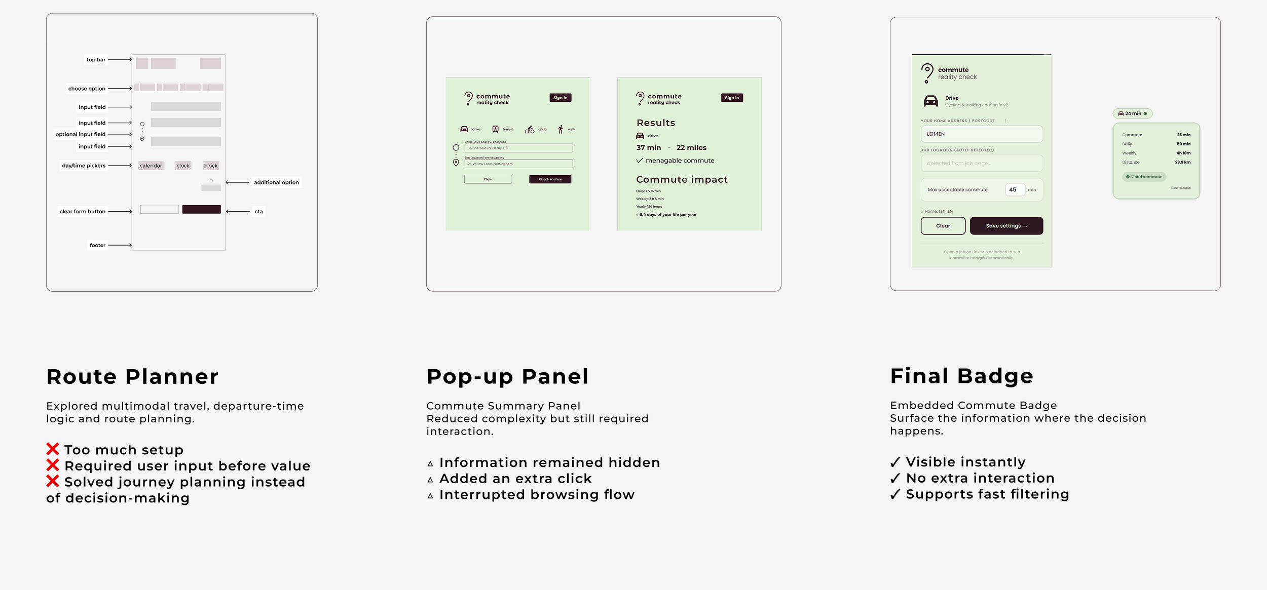
Design the intervention where the decision happens.
My first instinct was to build a journey-planning tool. I quickly realised that would be solving the wrong problem. Job seekers already have access to excellent route-planning tools. What they lack is commute context when they evaluate opportunities.
Instead of building another dashboard, I designed a lightweight intervention that lives directly inside existing job boards.
The goal was simple:
Help users decide whether a role deserves further attention before they open another tab.
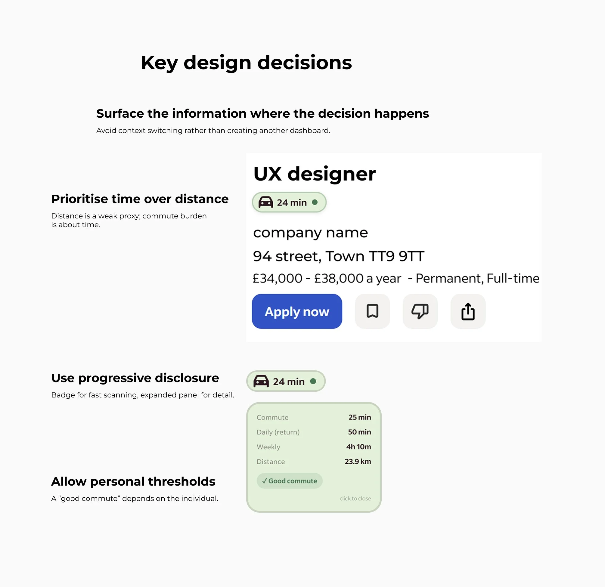
Key design decisions:
Prioritise time over distance. Distance is a poor proxy for effort. A 12-mile journey can take 15 minutes or more than an hour, depending on infrastructure and traffic patterns. The product prioritises commute time and treats distance as supporting information.
Use progressive disclosure. Job boards are already information-dense. The default badge surfaces a single decision signal. Additional detail only appears when requested.
Allow personal thresholds. A "good commute" is subjective. Users can define their own acceptable commute limit rather than relying on a fixed standard.
Architectual pivots
Constraints shaped the product
This project was built without engineering support, without a budget, and without access to paid mapping infrastructure. Those constraints shaped nearly every product decision.
Technical & financial constraints:
No backend
No paid APIs
No engineering team
Routing and geocoding rely on free services including OSRM and Photon.
Privacy by design
Commute calculation requires sensitive origin data. Rather than storing that information remotely, I designed the MVP to operate entirely within the browser. User settings remain local. No accounts. No database. No server-side storage.
Scope decisions
Early concepts included:
Public transport
Multi-modal journeys
Departure-time logic
Travel cost calculations
These ideas were intentionally removed. The goal was to reduce decision friction while browsing jobs. Every feature that moved the product away from that objective was cut.

The process exposed challenges I had not encountered in static design work, including unstable outputs, model drift, broken rewrites, and platform-specific failures.
The most important lesson was that product judgement remains essential when deciding what should be built, what should be removed, and when a solution is good enough to test.
AI as implementation scaffolding
I am not a software engineer.
To bridge the implementation gap, I used Claude and ChatGPT as development tools while retaining ownership of product decisions.
My role was to define:
The problem
The product behaviour
The interaction model
Success criteria
Edge cases
Failure states
The workflow was iterative:
Outcome
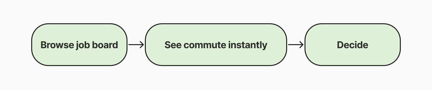
The experiment proved that commute visibility can be embedded directly into job listings using free routing services and no backend infrastructure. More importantly, it changed how I evaluated opportunities.
Commute became an immediate filtering signal rather than a separate research task.
Technical limitations:
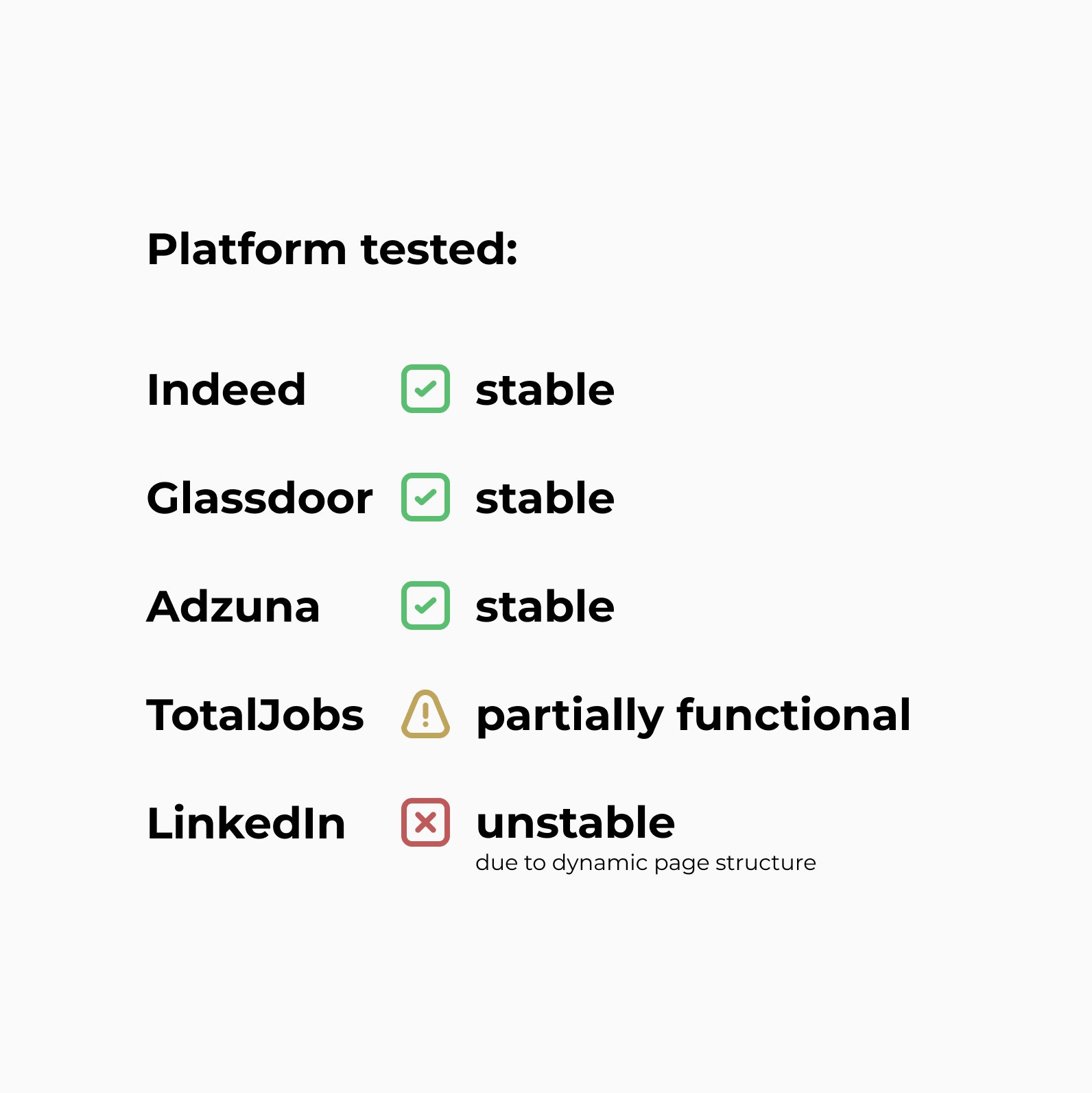
Browser extensions depend on systems they do not control.
The quality of the experience depends on employer location data and third-party page structures.
LinkedIn proved particularly difficult due to dynamic rendering, anti-scraping protections, and constantly changing page structures.
Key takeaways
This project demonstrates my ability to:
Identify a real-world workflow problem
Translate frustration into a testable product concept
Prioritise under technical and financial constraints
Design for privacy from the outset
Work across design and implementation boundaries
Use AI as a delivery tool without outsourcing product judgement
Looking back, the hardest part was reducing the problem to its essential form.